
Gothic calligraphy is a style of beautiful hand lettering that’s been around since the Middle Ages.[1] The actual term for this type of calligraphy is “blackletter,” and while there are a number of variations, this form of writing is beautiful and ornate. Whether you’re addressing wedding envelopes or you’re just looking for a new hobby, learning blackletter is a fun and challenging pursuit that anyone can enjoy!
Method 1
Choosing the Right Tools
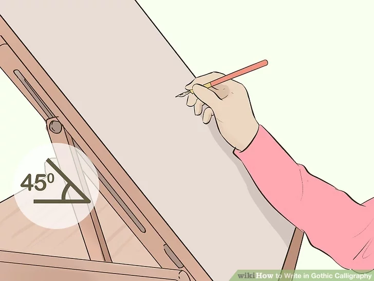
- 1Work on a sloped surface if you have one. Sitting hunched over a regular writing desk can restrict your arm movement and can create tension in your neck and shoulders. Since you have to move your whole wrist and arm to create calligraphy, a desk that’s sloped down toward you can give you more freedom of movement, resulting in neater lettering.[2]
- If you don’t have a sloped desk, try propping a piece of wood on a thick book on top of your desk. Try to create about a 45° angle.
- If all you have is a flat surface, that’s okay too! Just keep in mind it might be easier if you can find something to prop up to create a slope, especially if you plan to do a lot of calligraphy.
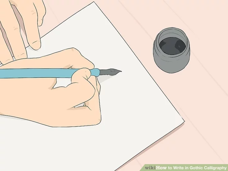
- 2Choose a dip pen and ink bottle for the most traditional setup. While you can practice calligraphy with any writing implement, original hand-lettering was done with a pen fitted with a nib. You then dip the nib in a bottle of ink, such as India ink. A small chamber inside the nib, called the vent, fills up with ink, and the ink flows out of the nib while you’re writing.[3]
- India ink is a thick, black ink that is most commonly used for hand-lettering.
- Look for a dip pen with a nib holder that’s about 15–20 cm (5.9–7.9 in), which is about the length of a regular ink pen.
- You can find dip pens and ink at a craft supply store or online. You may also be able to find them where office supplies are sold.
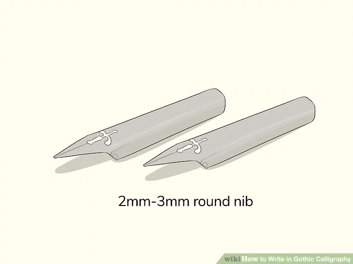
- 3Opt for a 2mm-3mm round nib with medium flexibility. When you’re choosing a nib, you don’t want it to be too flexible, as it will be difficult to create smooth, straight lines. Also, if you choose a nib that’s too small, it will be hard to see the serifs, or the horizontal flourishes at the top and bottom of the letters. A 2mm-3mm nib with a rounded tip and medium flexibility will be the easiest to control.[4]
- Look for a package that says “rounded” on it to find the right nib. Only the very tip will be rounded off, so the nib will still look pointed at first glance.
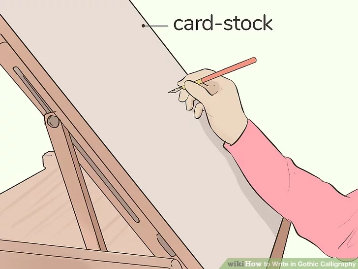
- 4Use heavy printer paper or cardstock to practice on. Most regular copy paper or notebook paper is too thin for the liquid ink. To help prevent the ink from bleeding through your paper, try using at least 120 gsm (32-lb) printer paper to practice on.
- If all you have is thin paper, stack 3-4 sheets together so the ink doesn’t bleed through.
- To create a finished project, consider using heavy cardstock.
- You can also find notebooks specifically for calligraphy practice. These are typically already lined. Look for these wherever stationery or crafting supplies are sold.
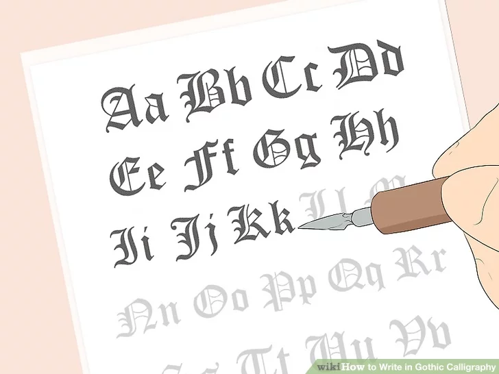
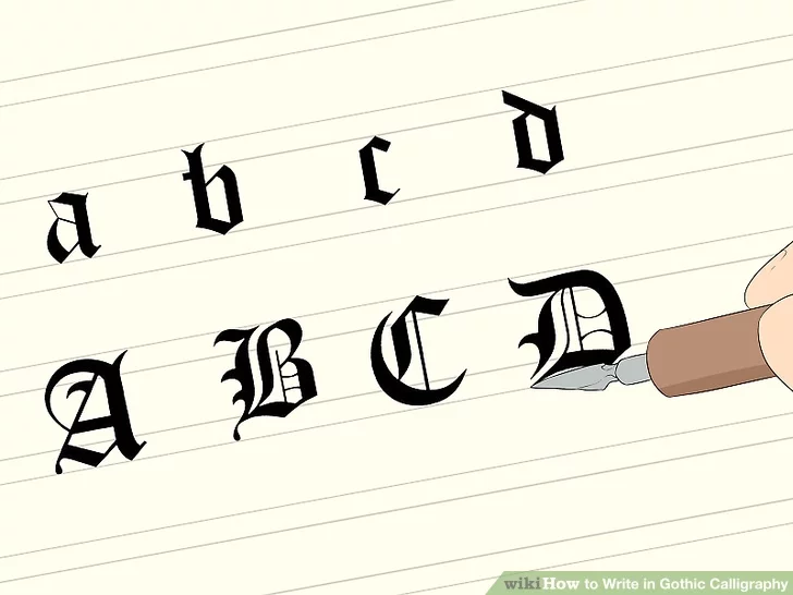
- 5Print out sample alphabet sheets and prop them close by your work stations. There are several different styles of blackletter calligraphy, including Textualis, Rotunda, Schwabacher, and Fraktur. Search online for the different styles and choose the one you like the most, then print out the alphabet so you can use it as a reference while you’re practicing. Textualis may be the easiest to start learning, since there aren’t as many curved lines.
- Textualis is ornate and square, and is perhaps the most common form of blackletter. The letters in Rotunda, as the name suggests, are more round. Schwabacher and Fraktur are both rounded as well, though not as much as Rotunda, and the two styles look very similar to each other. However, there are certain distinctions for specific letters.[5]
- For instance, in Fraktur, the capital “S” looks similar to a modern capital “G,” but in Schwabacher, it looks more like the “S” that’s used today. However, the capital letter “A” is nearly identical in both styles, resembling a modern lowercase “u.”
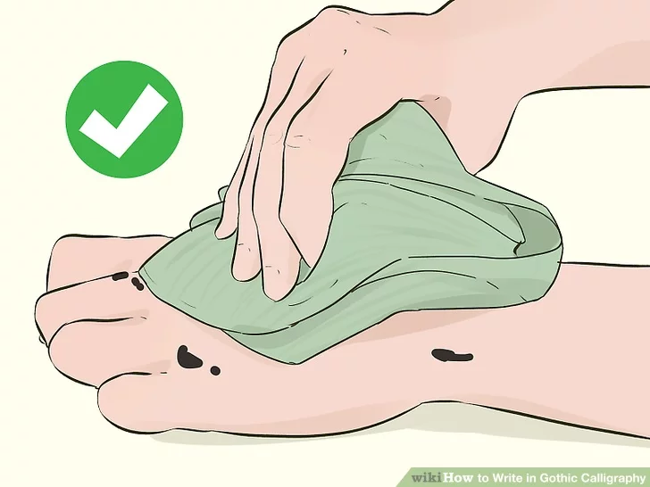
- 6Keep tissues, paper towels, or a cloth nearby to wipe up ink. Working with a dip pen can be messy. You may get ink on your fingers or your desk, or you may need to wipe up extra ink from the end of the nib. To make cleanup easier, it’s best to have some sort of cloth or tissue at your work station before you ever get started.[6]
- You may also want a small bowl of water nearby to make cleanup easier, but it isn’t necessary.
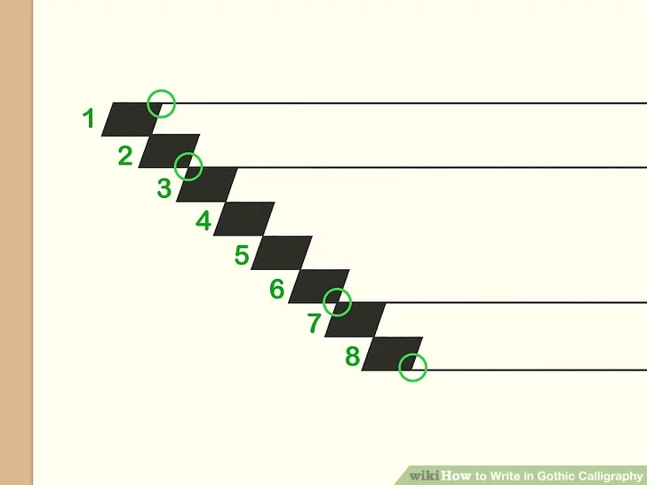
- 7Line your paper if it isn’t already lined. Draw a short, horizontal nib mark near the top of your paper. Then, move the tip of the pen down to the bottom right corner of that mark and draw another line. Repeat this for a total of 8 marks to create what looks like a pixelated diagonal line. Then, use a ruler and a pencil to draw 4 horizontal lines across the paper. Start the first line above the first nib mark, make the second between nib marks 2 and 3, put the third line between marks 6 and 7, and the last line below the 8th nib mark.[7]
- When you’re finished, you’ll have a middle row that’s 4 nib-widths high, with a top and a bottom row that are 2 nib-widths each.
- The middle row is called your x-height, and it’s where most of your lines will be drawn. Letters like “c,” “m,” and “o” will be entirely included in the x-height.
- The top row is for your ascenders, like on the letters “b,” “d,” and “h,” while the bottom row is for descenders, such as on “g,” “p,” and “y.”
Method 2
Practicing the Letters
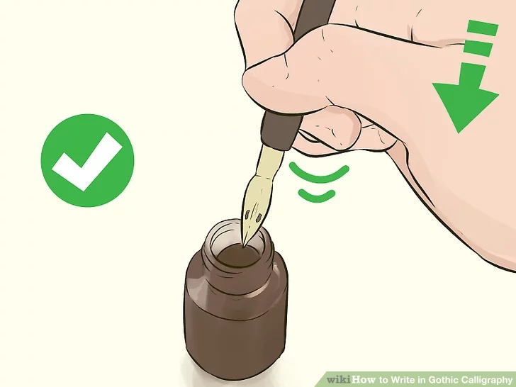
- 1Dip the pen nib in the ink, then shake it firmly. When you’re ready to start writing, dip the nib in the bottom of ink to fill the vent. Then, with the pen still held just inside the bottle, give the pen a quick downward shake. This should help remove any excess ink built up on the pen tip.[8]
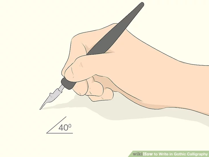
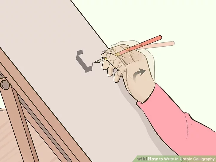
- 2Hold your pen at about a 40° angle to the paper. You don’t need a protractor to get exactly the precise angle, but you should practice holding the pen the right way. Use a normal pen grip, then hold the pen so it’s perpendicular to the paper, or straight out with the nib pointed at the sheet. Then, bring the pen down until it’s angled almost halfway between parallel and perpendicular. [9]
- This will give you more control over the pen, making it easier to create the strokes.

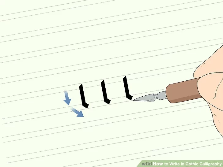
- 3Start by drawing a simple downward stroke. Touch the tip of the nib to the top of your x-height, or the middle row on your lined paper. Then, using even pressure, draw the tip of the nib straight down to create a vertical line.[10]
- Repeat this several times, trying to leave an equal amount of space between each line.
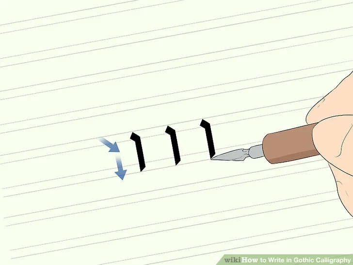
- 4Add a serif stroke to the bottom of a line. Once you feel comfortable with your vertical strokes, it’s time to add a flourish. Draw a vertical line just as you did before, then stop about 1 nib-width above the baseline and pull the pen to the right.[11]
- The serif should be a horizontal line about 1 nib-width across. If you lift the pen before drawing the serif, make sure it’s completely connected to the previous stroke, without any spaces.
- Practice this several times, as well.
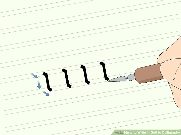
- 5Create a serif stroke at the top of a line. Many letters also have a serif at the top. To create this, start at the waist line, or the second line on your ruled sheet, and draw a horizontal stroke that’s about 1 nib-width to the right. Then, without picking the pen up from the paper, draw a line straight down to the baseline.[12]
- You can also practice starting your serif at the top line, rather than the waist line.
- 6Practice a line with a serif at the top and the bottom. Now that you’ve practiced creating serifs on the top and the bottom of the letters, it’s time to put it all together. Draw a serif at the top of your waist line, then draw a straight line down, stopping about 1 nib-width from the baseline. Finish by drawing another serif at the bottom of the line.[13]
- Keep practicing until the top and bottom serifs are the same size each time you draw this shape.
- This is a basic lower-case “i,” or a lowercase “l” if you start from the top line.
- 7Try tracing the letters before you draw them on your own. It can sometimes help to trace a letter to get a feel for its construction. Once you’ve mastered drawing a line with a serif, lay a sheet of printer paper over the sample alphabet you printed. Then, trace over the letter with your calligraphy pen, trying to match the serifs and flourishes as closely as possible.
- It can be helpful to practice one letter several times before moving on to the next one.
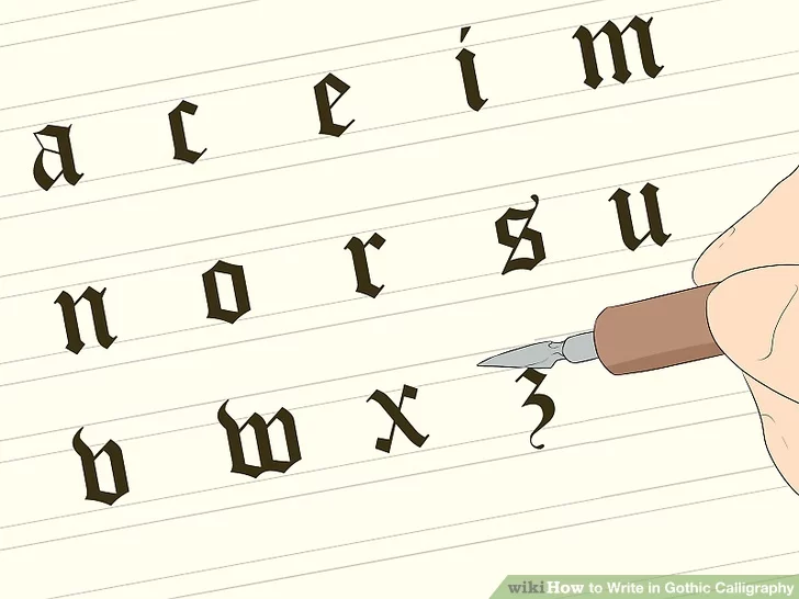
- 8Start practicing letters that fit in your x-height. Once you feel comfortable tracing the letters, start writing them freehand. Try practicing letters that are entirely contained in the x-height to start. Letters made up of all straight lines, like i, m, n, and w, are the easiest to learn first.[14]
- You’ve already practiced drawing “i” and “l,” so try drawing “m” next. This is an easy letter because it’s made of 3 straight lines, then 2 serifs as connectors.
- The letters “a,” “c,” “e,” “i,” “m,” “n,” “o,” “r,” “s,” “u,” “v,” “w,” “x,” and “z” will all be contained within the x-height.
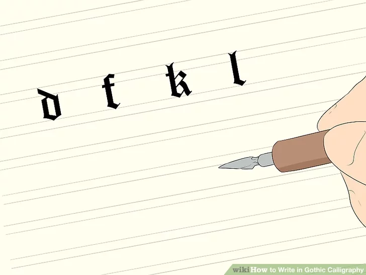
- 9Draw ascenders above the x-height. The row above the x-height is for your ascenders, or the long lines reaching up above letters like “b” and “h.” The top serif on the letter “t” also goes into your ascender row, although it’s not quite as tall as the other ascenders.[15]
- Other letters with an ascender are “d,” “f,” “k,” and “l.”
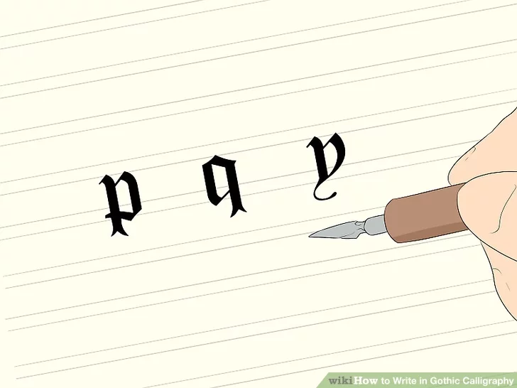
- 10Mark your descenders in the space below the x-height. For letters that drop down, like “g,” or “j,” draw your lines below the baseline, reaching all the way down to the bottom row. In some cases, you might add decorative flourishes that reach down in the descender’s row, also.
- Other letters with descenders are “p,” “q,” and “y.”
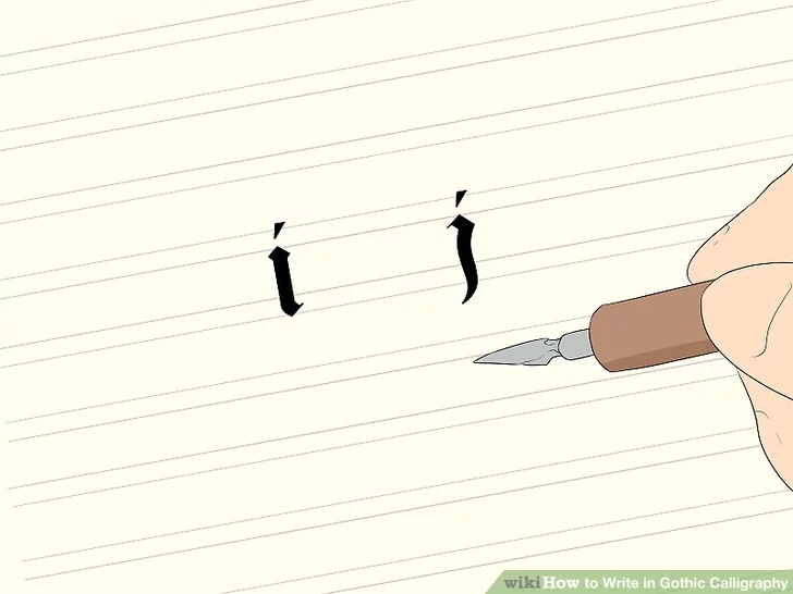
- 11Make a hairline stroke with the pen to dot the letters “i” and “j.” When you’re dotting an “i” or “j,” a dot will look too small, while a full nib-mark will be too wide. Instead, use the tip of your pen to create a very thin, angled stroke on top of those letters.[16]
- Typically, the mark will be angled upward from left to right. However, you can play around with this if you’d like to take more of a creative approach to your calligraphy.
Method 3
Improving Your Technique
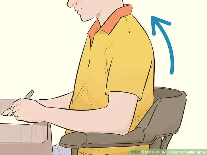
- 1Sit up straight and relax your arm muscles. Practicing good posture, with your back straight and your shoulders back, will give you better control over the pen, and it will help keep your letters neat and even. Also, try to keep your arm relaxed. If you grip the pen too tightly, your letters will be messy, and it will hard to get the artistic flair that’s characteristic of this lettering style.[17]
- Try keeping both feet on the floor while you’re writing.
- If you notice yourself getting stiff or tired, stand up and stretch for a few minutes.
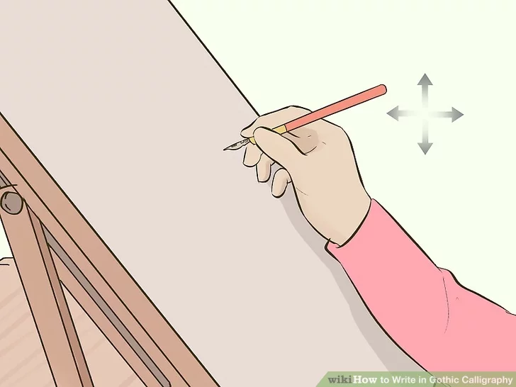
- 2Move your whole hand and wrist when you’re writing. Calligraphy is about broad strokes, so you don’t want to just move the pen with your fingers. Make sure your whole hand is engaged, including your wrist, as you create the strokes.[18]
- Although it might not seem like it, this will actually give you more control over your letters, and it will get easier with practice.
- 3Lift your pen between strokes. In calligraphy, letters are typically made with a number of strokes. To ensure your serifs are visible and each line is precise, lift your pen after you make each stroke.[19]
- It’s okay to make a line and a serif without lifting your pen, if you’d like.
- 4Practice lower-case letters first, then upper-case. Upper-case Gothic calligraphy tends to be more ornate than lower-case letters, with extra serifs and flourishes that can be difficult for a beginner. Take your time studying lower-case letters first. Once you’re comfortable with those, move on to capital letters.[20]
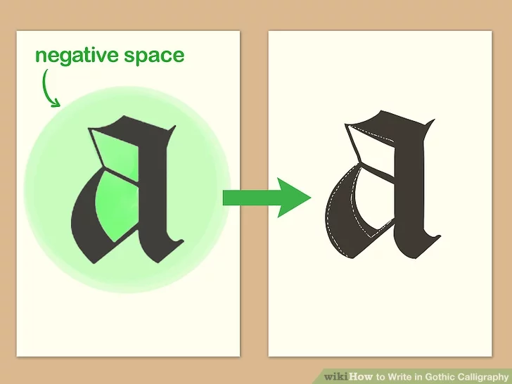
- 5Compare the negative space in your letters to the samples to find errors. The empty space in a letter, like the opening inside of an “o” or the space between the lines in an “m,” can be helpful when you’re trying to correct a shape that isn’t quite right. Look at the spaces and compare them to your sample letters to see if you can spot where you’re making an error.[21]
- For instance, by looking at the negative space, you might notice that there’s an uneven amount of space on either side of the middle line in an “m,” or that one serif is too low when you’re drawing the “o.”
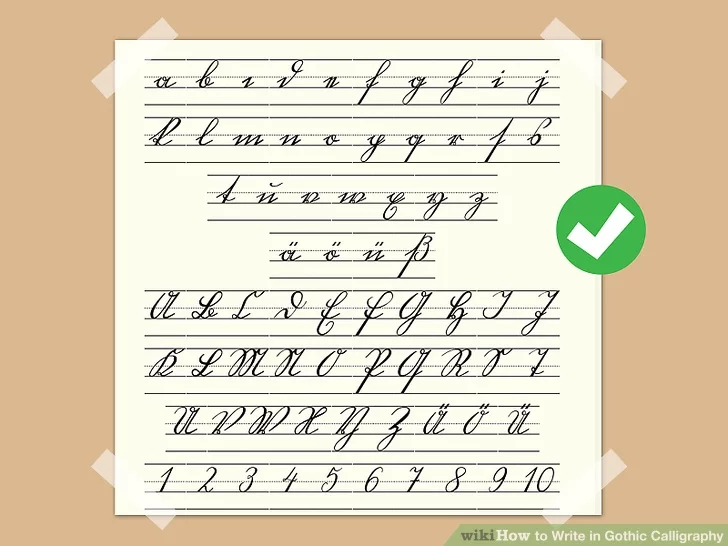
Sample Alphabets
Sample Gothic Calligraphy Alphabet
Sample Simple Calligraphy Alphabet
Community Q&A
Question: Can I write with pencil?
Answer: You can if you want, but writing with a pen will make it neater.
Question: What is the origin of Gothic handwriting?
Answer: It was used by clerks and scribes in the fifteenth century. It was used in documents printed in Germany, Switzerland, and Austria up until the twentieth century.\
Tips
- You can extend your x-height to 4.5 or 5 nib widths if you need more room.
References
- ↑http://www.designhistory.org/Handwriting_pages/Blackletter.html
- ↑https://www.calligraphy-skills.com/gothic-alphabet.html
- ↑https://thepostmansknock.com/how-to-use-a-dip-pen-to-create-modern-calligraphy/
- ↑https://calligraphypen.wordpress.com/2009/04/13/demystifying-gothic-lettering/
- ↑https://jakerainis.com/blog/blackletter-101-primer/
- ↑https://www.calligraphy-skills.com/gothic-alphabet.html
- ↑https://youtu.be/zITErNWAZS4?t=57
- ↑https://thepostmansknock.com/how-to-use-a-dip-pen-to-create-modern-calligraphy/
- ↑https://calligraphypen.wordpress.com/2009/04/13/demystifying-gothic-lettering/
- ↑https://calligraphypen.wordpress.com/2009/04/13/demystifying-gothic-lettering/
- ↑https://calligraphypen.wordpress.com/2009/04/13/demystifying-gothic-lettering/
- ↑https://calligraphypen.wordpress.com/2009/04/13/demystifying-gothic-lettering/
- ↑https://calligraphypen.wordpress.com/2009/04/13/demystifying-gothic-lettering/
- ↑https://www.calligraphy-skills.com/gothic-letters.html
- ↑https://www.calligraphy-skills.com/gothic-letters.html
- ↑https://calligraphypen.wordpress.com/2009/04/13/demystifying-gothic-lettering/
- ↑https://www.calligraphy-skills.com/gothic-alphabet.html
- ↑https://www.calligraphy-skills.com/gothic-alphabet.html
- ↑https://youtu.be/zITErNWAZS4?t=137
- ↑https://www.calligraphy-skills.com/gothic-writing.html
- ↑https://jakerainis.com/blog/create-consistent-alphabet/